
Speechcloud Brand Identity and Build
Speechcloud is a very fast growing startup on a mission to change education. With the company’s software that transcribes professor’s live lectures into text, they started as a way to help college students with learning and hearing disabilities. With feedback and further research into the many gaps in the education system, it has grown into a multi-faceted, one-stop education platform that is paving the way for better education.
After Speechcloud’s initial launch, the CEO reached out to me for a more elevated and ownable brand that spoke to its youthful and “easy” values.
I named, branded, and designed the initial screens for the product as well as giving continual feedback on further UI development.
Scope
Naming
Strategy
Logo, Typography, and Color
Product UI/UX
Brand Guidelines
Messaging
Social Media Templates
Continual UX Research
Product Development and further product design based on my guidelines by Speechcloud developer and CTO, Kyle Hale

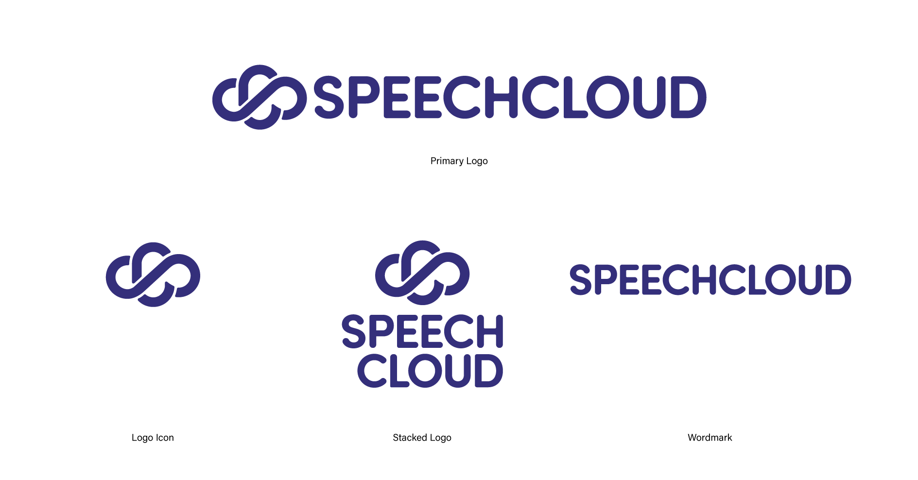

The new Speechcloud logo is a cleaner and sleeker version of its original which is a cloud shape that is made out of an “S” and a “C”.
The wordmark is a custom type solution using simplified, geometric forms with rounded edges to refer to the ease and intuition of the product itself.

Color Palette

Since Speechcloud is an accessibility product, we wanted to make sure that labels were paired with icons so that we could even the playing field for those with learning disabilities. Because of this I needed to come up with lots of different kinds of icons. Here are just a few.
Iconography & Typography

Screens


Visit https://www.speechcloud.com/ for more