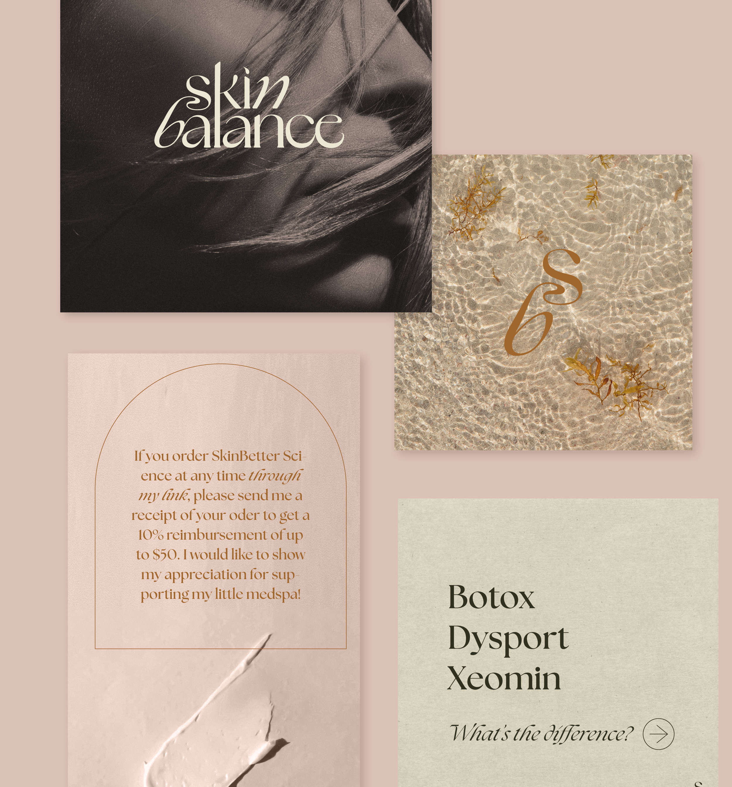
Skin Balance Brand Identity
Skin Balance is a Boston med spa offering neurotoxins, lasers, skin products, and skin education. They prioritize curated, specialized treatments for each patient to maximize results and minimize wasted time.
Founder Macinzey Ekins came to me wanting a natural, organic, and feminine design sensibility without the cliché med spa aesthetics she had seen so often. The goal was to make a visual presence that appealed to both those who were wanting treatments for medical and aesthetic reasons. It was also important to Macinzey that her clients felt comfortable, beautiful, and educated before any treatments were done—a “different way” of approaching clients than trying to sell them on treatments they didn’t need or want—so a comforting and less-than-sterile aesthetic was needed.
Scope
Logo
Wordmark
Typography and color
Social media assets
Brand guidelines
Stock imagery
Logos with Boston
I scoured the internet for the right typeface for the wordmark and when none of them were right..I drew my own. The forms are inspired by a few different fonts that I found photos of but not the actual fonts (otherwise I’d mention them here).
It’s a little bit feminine elegance, a little bit art nouveau freedom.
The logo is a condensed version of the connected s+b with the characteristic connecting swirl that is both a call to nature’s form and the dispensing squirt of product.


