Dot to Dot Brand Identity
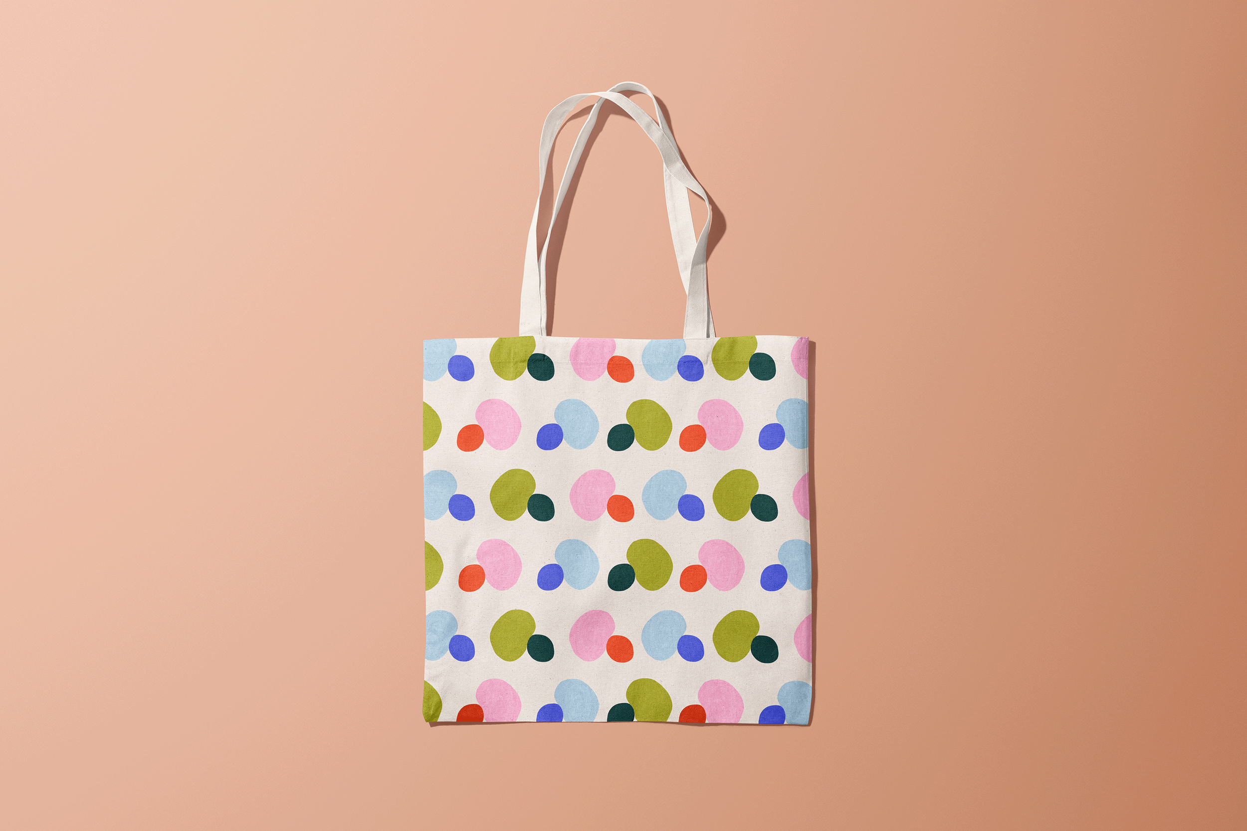
Dot to Dot is a new company that helps empower adults to be the best caretakers to the children they protect. Katie, the owner, wants to connect the dots between the caretakers they are to the caretakers they want to be through activities, scripts, and mind-frame shifts. With Katie’s knowledge and experience with early childhood development, she has created an expansive collection of digital downloads — games, language scripts, guides for building a “pause spot,” affirmation posters, how to set boundaries, etc — with simple instructions for how to implement each and maximize effectiveness. She felt confident about her credibility and products but not about her company’s brand identity and the products’ presentation and lack of cohesive image. Katie reached out wanting a brand that appeals to both the caregivers buying the assets and the children who will be interacting with the materials. After a few conversations and moodboards we landed on a “Sweedish preschool” concept —embracing natural shapes, textures, and colors and pairing them with geometric/clean typography.
Scope
Discovery & strategy
Logo
Wordmark
Typography & color
Stock imagery
Brand guidelines
Branded assets & templates
Web banners
This logo went through many different iterations but the end concept that won seems so obvious now—two dots (one representing an adult and the other a child) embracing.
The logo and two different are available in three different color combinations with the greens being the dominant color way.


