

UTAP Rebrand and UI/UX Design
Scope
Discovery and Strategy
Logo, Typography, and Color
Product UI/UX
Brand Guidelines
Continual UX research
Product development and further app design based on my guidelines by the Maxar dev team.


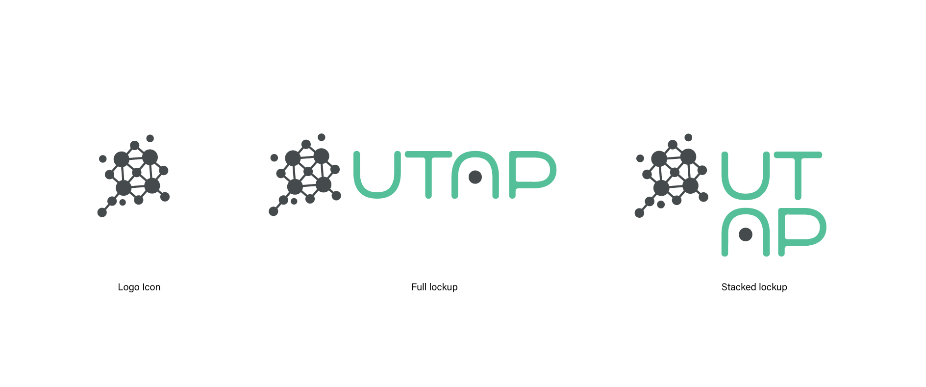
The new UTAP logo is a simplified version of its original which was a representation of making connections and a reference to a satellite.
The wordmark is a custom type solution using simplified, geometric forms to refer to the ease and intuition of the app itself.

“UTAP” is an acronym that I will not disclose for security reasons. The assets I am sharing will have changed information and have been approved for the public.
Illustrations and Animations


Strategy
After many user interviews and walkthroughs, it became clear that UTAP had many different types of users with different needs and approaches but they needed to be able to all communicate in the same space. To make sure I addressed each need and found the overlaps, I made journey maps for each user group. After days of prototyping these journeys, I was able to find the connections between user groups and illustrate the different ways UTAP could be experienced by each user.
This video was the product prototype so it showcases the beginning stages of its creation.